naab AI
Brand guide
How naab AI looks and sounds. It's the reference for anyone designing, writing or publishing something with the brand: a landing page, a post, a presentation, an email.
Last reviewed: 29 October 2026.
Name and logo
The name
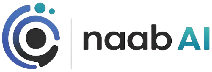
It's written naab AI: lowercase “naab” and uppercase “AI”, always, even at the start of a sentence. naab.ai is the address, not the name.
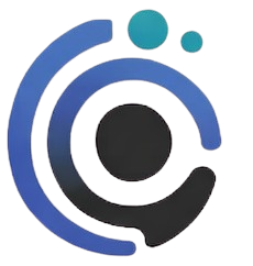
“naab” means “to measure” in Mayan. The dots in the symbol come from there: Mayan numerals counted with dots and bars, and were among the first in the world to have a zero. Measuring is exactly what the product does.
naab AI
- naab AI in any sentence, including at the start.
- Naab AI NAAB NaabAI naab.ai as the name.
The logo
How it's used
- Clear space. At least the height of the “n” on all four sides. Nothing touches it.
- Minimum size. 24 pixels tall on screen for the full logo; 16 for the symbol alone. In print, 8 millimetres.
- Backgrounds. White, canvas or dark navy. Never over a detailed photo or over the brand gradient.
- Next to other logos. At the same visual height as the rest, with its clear space, and never the smallest in the group.
What we don't do
- No stretching or squashing.
- No changing the colours.
- No rotating.
- No shadows or outlines.
Colour
Six brand colours and a set of neutrals. Each colour has a job and they don't swap: if something is jade, it's yours; if something is navy, it's naab's.
- naab blue
#4058a8The blue of the symbol, with its gradient up to #4870b8. Brand: logo, covers, brand pieces. - Teal
#1888a0The colour of the dots and the “AI”, up to #2898a8. Brand: alongside the blue, never alone in the interface. - Navy
#2a3f7eEverything interactive: buttons, links, what naab does. Dark, #131c36, for backgrounds. - Jade
#00a878Reserved for “you”: your brand, your numbers, what a person approves. As text, #007a58. - Terra
#c94332Drops, wasted spend, what gets removed. As small text, #b63a2a. - Gold
#daa520To highlight one thing per screen. Fill only, never as text on white.
Neutrals
- Ink
#16181d - Ink 2
#565a64 - Line
#e6e7ea - Canvas
#f7f7f8 - Paper
#ffffff - Dark navy
#131c36
Contrast
The combinations we use, with their measured contrast. Body text needs 4.5 to 1; large headings and fills, 3 to 1.
| Sample | Combination | Contrast | Used for |
|---|---|---|---|
| Aa | Ink on paper | 17.8 to 1 | Text |
| Aa | Ink 2 on paper | 6.9 to 1 | Secondary text |
| Aa | Navy on paper | 9.9 to 1 | Text, links and buttons |
| Aa | White on dark navy | 16.8 to 1 | Text on dark backgrounds |
| Aa | naab blue on paper | 6.6 to 1 | Headings in brand pieces |
| Aa | Teal on paper | 4.1 to 1 | Large headings and fills only |
| Aa | Jade text on paper | 5.4 to 1 | Text in jade. Pure jade, 3.1, fills and borders only |
| Aa | Terra text on paper | 5.8 to 1 | Drops in text. Pure terra, 4.8, in large figures |
| Aa | Ink on gold | 7.9 to 1 | The only thing that goes on gold. Gold on paper, 2.2: never as text |
| Aa | Jade on dark navy | 5.5 to 1 | Your numbers on dark backgrounds |
| Aa | Light navy on dark navy | 6.5 to 1 | Accents on dark backgrounds |
Typography
Figtree, a single family for everything: headings, text, buttons and figures. It's by Erik Kennedy, under a libre licence (SIL Open Font License), and the website serves it from its own servers.
ABCDEFGHIJKLMNOPQRSTUVWXYZ
0123456789 € % ? ! “ ”
| Use | Weight | Size | Example |
|---|---|---|---|
| Home page headline | 800 | 40 to 80 px | Your paid marketing |
| Section heading | 750 | 32 to 56 px | What naab is |
| Subheading and lead | 400 to 650 | 19 to 22 px | A connector for the AI you already use. |
| Body text | 400 | 17 px, line height 1.55 | naab proposes; you approve; naab applies it. |
| Interface and buttons | 700 | 15 to 16 px | Request access |
| Notes and labels | 400 to 700 | 13 to 14 px | Illustrative example with a fictitious brand |
- Letter spacing. Headings at −0.03 em; body text as it comes.
- Figures. Tabular in tables and amounts, so columns line up. Amounts carry their currency and thousands separator: €14,900.
- Capitals. Only at the start of a sentence and in proper names. No all-caps labels or all-caps headings.
- In the application, for now, Inter. Figtree is the typeface of the brand and the website.
Voice
naab speaks plainly, directly to you, and with numbers. If one person wouldn't say a sentence to another in conversation, naab doesn't say it either.
- Direct, and short. One idea per sentence. No title case and no exclamation marks.
- No jargon. “Searches” before “search terms”, “cost per sale” before “CPA”. If the acronym is needed, it comes afterwards, in brackets.
- Real numbers or none. No made-up figures, no “up to 30%”. When an example is fictitious, it says so: the “Illustrative example” label is always visible.
- Honest about limits. What naab doesn't do is said as clearly as what it does. A connector with a limitation tells you about it.
- naab isn't a person. It doesn't say “I am” or “I think”. The one speaking in the first person is your AI; naab is the connector.
- In Spanish and in English. Both versions say the same thing. The Spanish one prevails.
Like this, not like that
Building blocks
What repeats across everything naab publishes. These are the website's real pieces, with their classes and colours: what you see here is what there is.
Buttons
Navy for the main action, one per screen; the secondary one has a border. The text says what happens when you press it: “Request access”, not “Submit”.
Labels
Light navy for what naab does, jade for what's yours. The example label, whenever there are fictitious figures or brands.
Conversation
You in light jade, on the right. Your AI in a white card with a border, on the left. What naab looks up, in a list with check marks.
Icons
Outlined, 1.8 pixels at 24, rounded corners and a single colour. No filled icons, no coloured icons, no shadows.
Images
Screenshots and mock-ups of the product. Never stock photos, stock people or generic “artificial intelligence” illustrations with brains or circuits. A chart carries real numbers or the example label.
Backgrounds
White, canvas and dark navy. The brand gradient, from blue to teal, is reserved for brand pieces: logo, document covers, avatars. It doesn't go in the interface.
Downloads
The logo files, with a transparent background. Use them as they are: no recolouring, no cropping.
- Full logoPNG, 713 × 242 pixelsDownload
- SymbolPNG, 230 × 242 pixelsDownload
- LettersPNG, 434 × 121 pixelsDownload
- Animated logoMP4, 684 × 684 pixels, 8-second loopDownload
Need the logo as a vector or in white? Write to hi@naab.ai.